Components
Filters
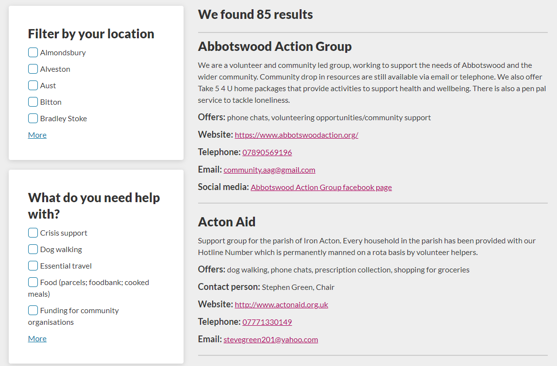
We use filters when we want the user to filter down their results.
You must:
- use filters on the left handside, and the results on the right
- avoid iconography when display results, unless agreed with Digital first. Text labels are always preferable and better for accessibility
- don’t use too many filters to make it very granular as this dilutes the results
- not everything has to be a filter, additional context can be displayed within the result card
An example of what it looks like together:
